“Can we describe this entire distribution with just 2 numbers?”
So far we have described distributions empirically — we plot the actual data. Empirical descriptions are specific to this sample. If we collect new data, the histogram shifts slightly.
A parametric model says: “this data comes from a known family of distributions, characterised by a small number of parameters.” If the model fits well, we can:
Describe the distribution in 2–3 numbers instead of thousands
Generate synthetic data
Compute probabilities analytically
Compare datasets on the same scale
19.2 The exponential distribution
When it appears: waiting times between events, inter-arrival times, survival times.
f(x; \lambda) \;=\; \lambda e^{-\lambda x}, \qquad x \geq 0
Parameters: one — the rate \lambda (events per unit time), or equivalently the mean \mu = 1/\lambda.
Key property: memoryless. The probability of waiting another t minutes is the same regardless of how long you’ve already waited.
TipDetecting exponential shape
If X \sim \text{Exponential}(\lambda), then on a log-y axis the complementary CDF becomes a straight line:
\ln(1 - F(x)) \;=\; -\lambda x
If the complementary CDF looks linear on a log scale, the data is exponential.
19.3 The normal distribution
The most famous distribution in statistics. Also called Gaussian.
Parameters: mean \mu and standard deviation \sigma.
Bell shape, symmetric, with the 68–95–99.7 rule:
68 % of data within 1\sigma of the mean
95 % within 2\sigma
99.7 % within 3\sigma
In NSFG: birth weight is approximately normal. Many measurement errors are normal (by the Central Limit Theorem).
19.3.1 Normal probability plot
Plot the data against what you’d expect if it were perfectly normal:
Sort your data x_1 \leq x_2 \leq \ldots \leq x_n
Compute the expected normal quantiles q_i = \Phi^{-1}(i/n)
Plot x_i vs q_i
If the data is normal, the plot is a straight line. Curves indicate skew or heavy tails.
19.4 The lognormal distribution
If \ln(X) is normally distributed, then X is lognormal.
f(x; \mu, \sigma) \;=\; \frac{1}{x\sigma\sqrt{2\pi}}
\exp\!\left(-\frac{(\ln x - \mu)^2}{2\sigma^2}\right)
When it appears: anything that is the product of many independent factors. Income, city populations, file sizes, biological growth rates.
19.5 The Pareto distribution
Named after economist Vilfredo Pareto. Describes the “80/20 rule”.
f(x; x_m, \alpha) \;=\; \frac{\alpha x_m^\alpha}{x^{\alpha+1}},
\qquad x \geq x_m
Parameters: minimum value x_m and shape \alpha.
When it appears: wealth, city sizes, earthquake magnitudes, word frequencies. Very heavy right tail — extreme values are much more common than a normal distribution predicts.
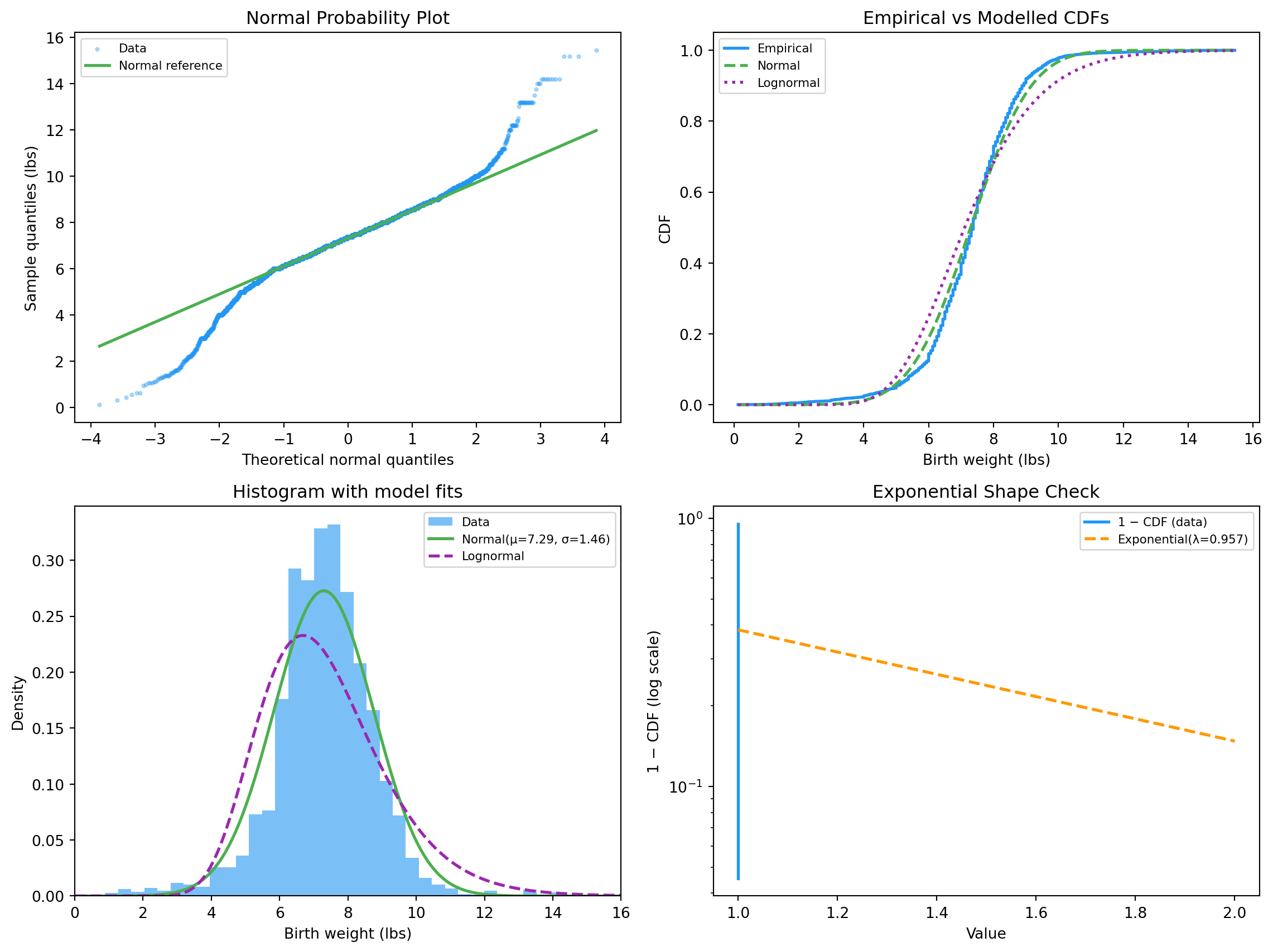
Normal fit (birth weight)
  mu    : 7.294 lbs
  sigma : 1.463 lbs

68-95-99.7 rule check:
  within 1σ: 0.767  (expected 0.683)
  within 2σ: 0.952  (expected 0.954)
  within 3σ: 0.983  (expected 0.997)
The within-1σ fraction matches the theory closely. Within-2σ and 3σ slightly under-shoot — birth weight has a heavier-than-normal left tail (premature babies).
Lognormal fit
  mu_log    : 1.9617
  sigma_log : 0.2485
  median    : 7.111 lbs (= e^mu_log)
19.8 Goodness of fit — the KS test
The Kolmogorov–Smirnov test asks: is the data consistent with a given distribution? It computes D = \max | F_{\text{empirical}}(x) -
F_{\text{model}}(x)|. Small D, large p → the model is plausible.
Normal    : D=0.0653   p=0.0000
Lognormal : D=0.1241   p=0.0000
Both fits are imperfect (with n \approx 9000, even tiny discrepancies become “significant”). Eyeballing the visual fit is more useful than the p value at this sample size.