The question
“Does a mother’s age predict the birth weight of her baby?”
All previous chapters studied one variable at a time. Now we ask: do two variables move together? And if so, how strongly?
Scatter plots
The first tool for any relationship: plot one variable against the other. With 9 000 points, dots overlap completely. Standard fixes:
Jitter — add small random noise so overlapping points spread outAlpha — make each dot semi-transparent; dense regions appear darkerBin and mean — divide x into bins, plot mean y per bin (shows trend clearly)Hexbin — 2D histogram using hexagonal bins
Characterising relationships
Before computing a correlation coefficient, ask:
Is the relationship linear or curved ?
Is it monotone (always increasing or always decreasing)?
Are there subgroups that behave differently?
Are there outliers that dominate the relationship?
A correlation coefficient summarises only point 1. Always look at the scatter plot first.
Covariance
\operatorname{Cov}(X, Y) \;=\;
\frac{1}{n}\sum_{i=1}^n (x_i - \bar{x})(y_i - \bar{y})
Positive: when X is high, Y tends to be high
Negative: when X is high, Y tends to be low
Covariance has units (lbs × years for our example) — comparing covariances across pairs is meaningless.
Pearson’s correlation
Normalise covariance by the product of standard deviations:
r \;=\; \frac{\operatorname{Cov}(X, Y)}{\sigma_X \sigma_Y}
\;=\; \frac{\sum(x_i - \bar{x})(y_i - \bar{y})}
{\sqrt{\sum(x_i - \bar{x})^2 \sum(y_i - \bar{y})^2}}
Now r \in [-1, 1] :
r = +1 : perfect positive linear relationshipr = -1 : perfect negative linear relationshipr = 0 : no linear relationship
It means no linear relationship . The data can have a strong curved relationship and still produce r = 0 . Always plot first.
Spearman’s rank correlation
Pearson’s r applied to ranks , not values:
Replace each x_i with its rank
Replace each y_i with its rank
Compute Pearson’s r on the ranks
\rho \;=\; 1 - \frac{6 \sum d_i^2}{n(n^2 - 1)}
where d_i is the difference in ranks.
Use Spearman when: the relationship is monotone but not linear; outliers are present; data is ordinal.
Computing it on NSFG
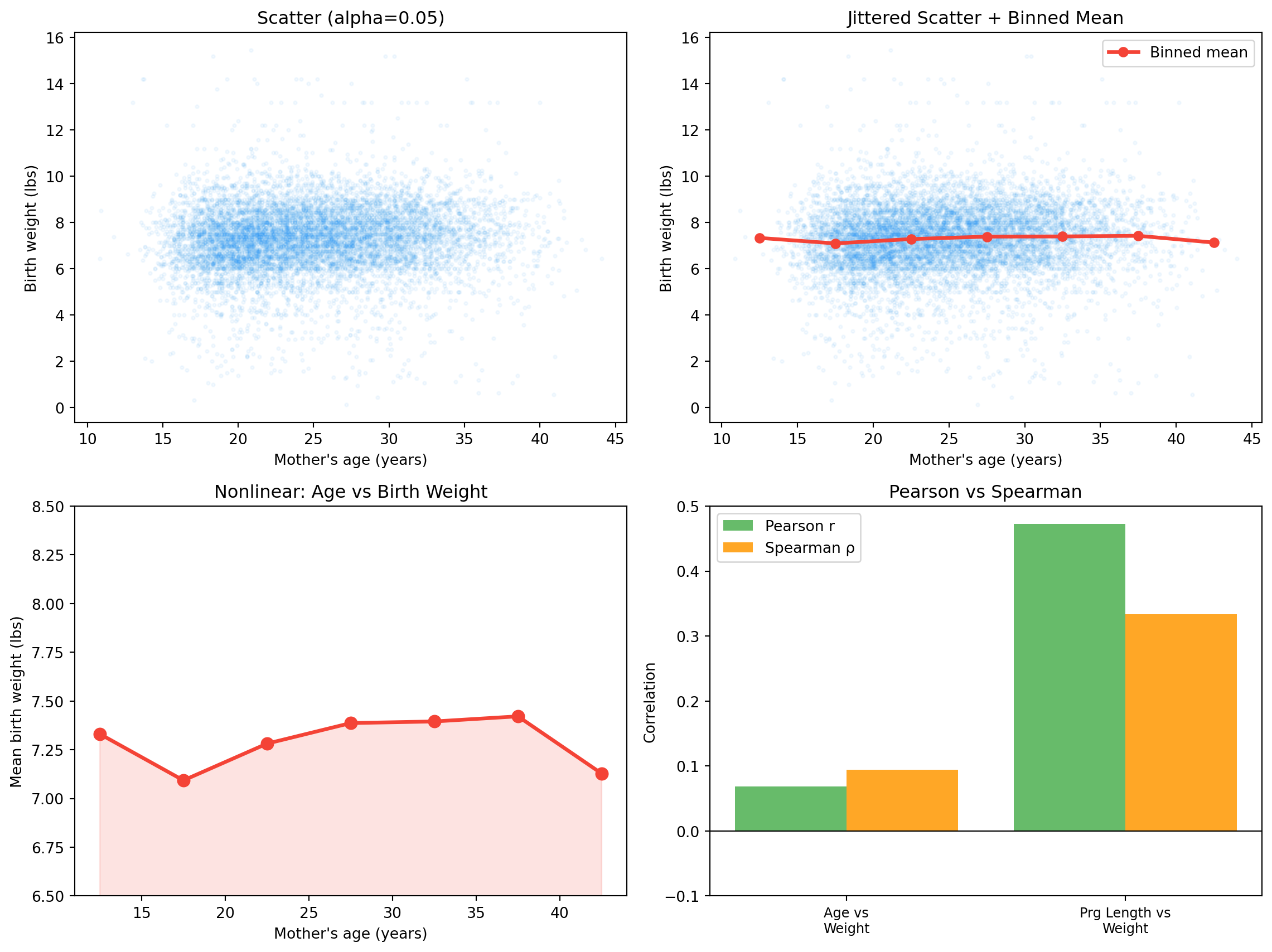
import sys, osimport numpy as npimport matplotlib.pyplot as plt0 , os.path.dirname(os.path.abspath("__file__" )) or "." )from _nsfg import load_groups, COLORS= load_groups()= live[["agepreg" , "totalwgt_lb" , "prglngth" ]].dropna()= df[(df["totalwgt_lb" ] > 0 ) & (df["totalwgt_lb" ] < 20 )]= df[(df["agepreg" ] > 10 ) & (df["agepreg" ] < 50 )]= df["agepreg" ].values= df["totalwgt_lb" ].values= df["prglngth" ].valuesdef covariance(x, y):return np.mean((x - x.mean()) * (y - y.mean()))def pearson_r(x, y):return covariance(x, y) / (x.std() * y.std())def rank_array(x):= np.argsort(x)= np.empty(len (x))= np.arange(1 , len (x) + 1 )return ranksdef spearman_rho(x, y):return pearson_r(rank_array(x), rank_array(y))print ("── Mother's age vs birth weight ─────────────────────" )print (f" Covariance : { covariance(age, weight):.4f} (lbs × years)" )print (f" Pearson r : { pearson_r(age, weight):+.4f} " )print (f" Spearman ρ : { spearman_rho(age, weight):+.4f} " )print ()print ("── Pregnancy length vs birth weight ─────────────────" )print (f" Pearson r : { pearson_r(prg, weight):+.4f} " )print (f" Spearman ρ : { spearman_rho(prg, weight):+.4f} " )
── Mother's age vs birth weight ─────────────────────
  Covariance : 0.5561 (lbs × years)
  Pearson r  : +0.0684
  Spearman ρ : +0.0940

── Pregnancy length vs birth weight ─────────────────
  Pearson r  : +0.4729
  Spearman ρ : +0.3335
Pregnancy-length vs weight: strong positive correlation — longer pregnancies produce heavier babies. Age vs weight: weak positive correlation — but Pearson’s r misses something the binned-mean plot will reveal.
Binned mean — revealing nonlinearity
= np.arange(10 , 50 , 5 )= [], [], []for lo, hi in zip (age_bins[:- 1 ], age_bins[1 :]):= (age >= lo) & (age < hi)if mask.sum () > 10 :+ hi) / 2 )int (mask.sum ()))print (f" { 'Age range' :>14} { 'Mean wgt (lbs)' :>15} { 'n' :>6} " )for c, m, n in zip (bin_centers, bin_means, bin_counts):print (f" { c- 2.5 :.0f} – { c+ 2.5 :.0f} years { m:>12.3f} { n:>6,} " )
       Age range   Mean wgt (lbs)       n
  10–15 years          7.331        61
  15–20 years          7.093     1,860
  20–25 years          7.282     2,975
  25–30 years          7.387     2,346
  30–35 years          7.395     1,399
  35–40 years          7.421       406
  40–45 years          7.128        37
The relationship is U-shaped : very young mothers (teens) have lighter babies; mothers in their 20s and 30s have the heaviest; mothers above 40 have slightly lighter babies again. Pearson’s r flattens this U into a single near-zero number.
Correlation and causation
The most abused concept in statistics.
Correlation tells you two variables are associated. It says nothing about why . Ice cream sales and drowning rates are positively correlated. The cause is summer (a confound), not ice cream.
Establishing causation requires either:
A randomised controlled experiment
A natural experiment (quasi-random assignment)
Careful matching/adjustment for confounds
Observational data like NSFG can only establish association.
Visualising it
42 )= plt.subplots(2 , 2 , figsize= (12 , 9 ))# 1. Raw scatter — too dense = axes[0 , 0 ]= 0.05 , s= 5 , color= COLORS["first" ])"Mother's age (years)" )"Birth weight (lbs)" )"Scatter (alpha=0.05)" )# 2. Jitter + binned mean = axes[0 , 1 ]= age + np.random.normal(0 , 0.3 , len (age))= 0.05 , s= 5 , color= COLORS["first" ])= COLORS["highlight" ],= 2.5 , marker= "o" , markersize= 6 , label= "Binned mean" )"Mother's age (years)" )"Birth weight (lbs)" )"Jittered Scatter + Binned Mean" )# 3. Binned mean alone — U shape clearer = axes[1 , 0 ]= COLORS["highlight" ],= 2.5 , marker= "o" , markersize= 8 )= 0.15 , color= COLORS["highlight" ])"Mother's age (years)" )"Mean birth weight (lbs)" )"Nonlinear: Age vs Birth Weight" )6.5 , 8.5 )# 4. Pearson vs Spearman across pairs = axes[1 , 1 ]= ["Age vs \n Weight" , "Prg Length vs \n Weight" ]= [pearson_r(age, weight), pearson_r(prg, weight)]= [spearman_rho(age, weight), spearman_rho(prg, weight)]= np.arange(len (pairs))- 0.2 , pearson_vals, width= 0.4 , color= COLORS["other" ],= 0.85 , label= "Pearson r" )+ 0.2 , spearman_vals, width= 0.4 , color= "#FF9800" ,= 0.85 , label= "Spearman ρ" )0 , color= "black" , linewidth= 0.8 )= 9 )"Correlation" )"Pearson vs Spearman" )- 0.1 , 0.5 )
Exercises
Make a scatter plot of mother’s age vs birth weight with alpha=0.1. What pattern do you see?
Compute Pearson’s r between age and birth weight. Is it strong?
Compute Spearman’s \rho for the same pair. How does it compare?
Bin mother’s age into 5-year groups and plot mean birth weight per bin. What shape do you see?
Compute r between pregnancy length and birth weight. Which pair is more strongly correlated?
Glossary
scatter plot — one point per observation.
jitter — small random noise to avoid overplotting.
covariance — \operatorname{Cov}(X,Y) ; direction of linear association; has units.
Pearson’s r — normalised covariance; unit-free; linear association.
Spearman’s ρ — Pearson’s r on ranks; monotone association; robust to outliers.
confound — a third variable that causes both X and Y .
correlation ≠ causation — association does not imply causation.